
How to Choose Exterior Paint Color for Your Home in Maple Grove, MN
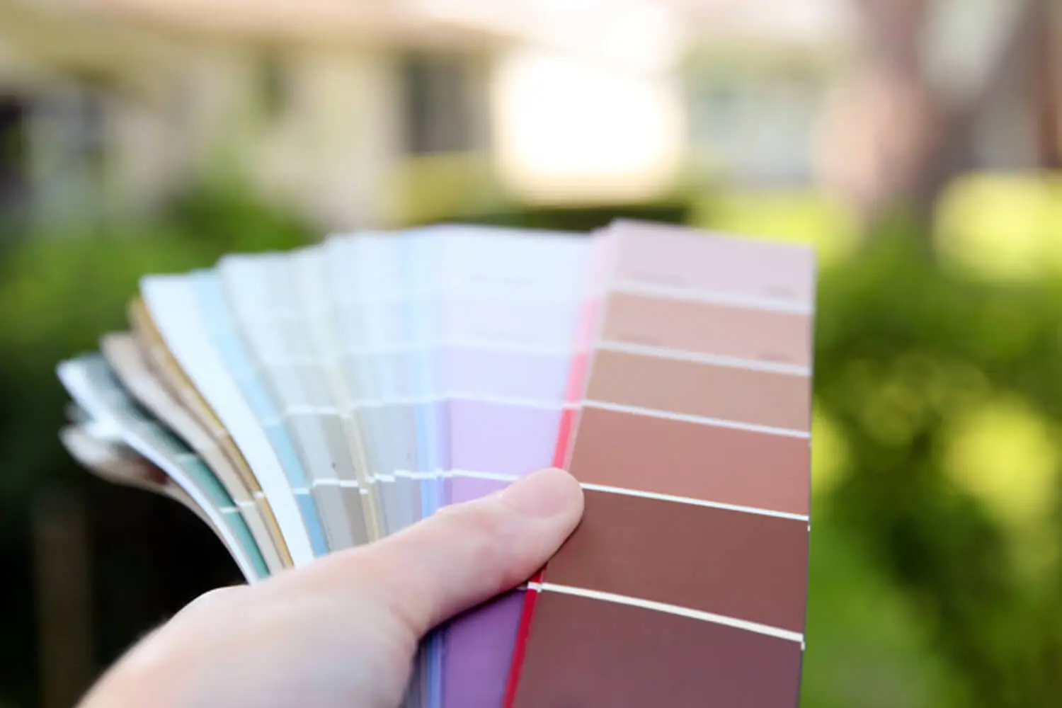
You’ve already decided it’s time to repaint. You know you want a change. Now you’re standing in front of hundreds of color options and feeling stuck. That’s where most homeowners land, and it makes sense. The surface area is enormous. The decision is public. The color chip looks nothing like what the house will actually look like in October. The whole process feels like guessing.
Here’s the reframe: choosing how to choose exterior paint color for your home isn’t a single decision. It’s a series of narrowing steps. The first step has nothing to do with colors you like. It has everything to do with what your house already has that you can’t change. Once you’ve confirmed the exterior needs repainting and you’re ready to move into color, this framework gives you a reliable path through the decision.
Start With What You Can’t Change
Every Maple Grove home has fixed elements — surfaces that won’t get painted and will live alongside whatever color you choose. These elements have more say in your final color than your personal preference does.
Common fixed elements on Maple Grove homes built in the 1980s through 2000s include:
- Asphalt shingle roofs, usually brown or charcoal
- Brick accents near the entry or chimney
- Stone foundation bands or entry columns
- Vinyl windows in white or tan frames
- Concrete driveways
The key is reading the undertone of each fixed element. Hold your brick, stone, or a shingle up next to a neutral gray and ask whether it reads warmer or cooler. Warm undertones — orange-beige, gold-beige, tan — push the siding color toward warm neutrals. Cool undertones — blue-gray, green-gray, violet-gray — allow cooler neutrals but fight warm ones.
Your siding color doesn’t have to match your fixed elements. It does have to coordinate with their undertone. A warm brick accent next to a cool gray siding looks like a mistake, and no amount of good lighting changes that.
Let Your Home’s Architecture Guide the Color Range
Maple Grove’s housing stock runs three main styles: colonial, craftsman, and the suburban two-story built in quantity from the mid-1980s through the early 2000s. Each has color traditions worth knowing before you start narrowing options.
Colonial homes pair best with classic muted palettes — creamy off-whites, soft grays, navy, or forest green with white trim. Saturated or bold colors read as out of place on a colonial facade.
Craftsman homes offer more flexibility. Earthy tones work well here — warm greens, deep taupes, muted ochres, and warm browns that emphasize natural materials. Craftsman homes also support a darker body color with contrasting trim better than colonials typically do.
Suburban two-stories are the most common type in Maple Grove and the most flexible. They read well in a wide range of neutrals, from warm greiges to soft blues to muted sage. The risk is choosing a trend color that dates quickly. Mid-tone neutrals with good undertones age better over a ten-year paint cycle than anything that felt current in a specific year.
A useful exercise: look at how other homes of the same style in your neighborhood are painted. Not to copy them, but to understand the range that reads as architecturally appropriate.
Account for How Minnesota’s Light Changes the Color
This is the variable no national color guide covers. Minnesota’s light in October is not the same as it is in July, and a color chosen on a bright summer day will read differently for half the year.
July light in Maple Grove is warm, direct, and high-angle. It washes colors out and makes them appear lighter and warmer than on a chip. A medium warm gray in July sun can look almost white on the house.
From October through March, the light flattens. Overcast skies and low sun angles strip away the warm wash and reveal the paint’s undertone directly. A color with even a slight blue-gray undertone that looked neutral in summer will look distinctly cool and flat in November.
Colors that hold up year-round in Minnesota tend to be warm neutrals with enough depth to read well in flat light: greiges, warm grays, soft taupes, and muted warm whites. Purely cool grays and blue-based neutrals often disappoint through winter. Minnesota snow also matters near the foundation — white and very light colors show road salt residue and snowmelt grime quickly. Slightly deeper tones at the base of the house age more gracefully.
Once the color is chosen, timing the project correctly matters just as much as the color itself.
Go Darker and More Muted Than You Think
Two principles hold across every housing style and climate. Go darker than the chip suggests. Go more muted than your instinct.
Exterior paint looks significantly lighter on a house than it does on a chip. Large surface area, ambient light bouncing off neighboring surfaces, and the sky above all conspire to wash the color out. A color that looks like a confident medium tone in the store will read as pale on the house. The rule of thumb: pick two or three steps darker than your first instinct on the paint strip.
Saturated colors also amplify outdoors. A color that reads as sophisticated indoors can look aggressive on a whole house facade. This is especially true in the upper Midwest, where housing tradition favors low-chroma, muted colors that feel grounded rather than expressive.
The white exception follows the same rule. True bright whites look clinical and reflective on an exterior. The homes that read as beautiful whites are almost always painted in creamy off-whites, warm greiges, or soft taupes. Go warmer and slightly darker than pure white, and the house will still read as white while looking far more finished.
Build a Complete Palette, Not Just a Body Color
The body color is the hardest decision. It’s not the only one. A complete exterior palette has three components that work as a coordinated system:
- Body color (siding)
- Trim color (fascia, window frames, rooflines)
- Accent color (front door, shutters, garage door)
Most Maple Grove homes use white or off-white trim for good reason. It defines the architecture and makes windows and rooflines read cleanly. The trim color should share the undertone of the body color. A warm-toned body needs a warm white trim, not a bright cool white that fights it.
The door and accent color is where personal expression enters the palette with the least risk. A front door in a deeper, more saturated version of the body color’s undertone family — navy on a gray house, deep red on a warm greige house — reads as intentional and polished. The door color can also echo a fixed element: a home with a warm brick accent can carry a deep terracotta or burgundy door well. If you’re curious about what your color choices say about your home’s personality, that’s worth exploring as you work through the accent decision.
Garage doors make up a significant portion of the front facade on most Maple Grove homes. A garage door matching the trim color creates continuity. One matching the body color can make the facade feel heavier. A contrast garage door in an accent color is a bolder choice that works on the right architecture.
Test Before You Commit
Paint chips and digital visualizers narrow the field. Neither shows what the color will actually look like on the house. Large samples evaluated outside are the only reliable test.
Paint swatches at least 12 by 12 inches directly on the siding or on foam board held against the house. Small chips are too small to read at whole-house scale. Then:
- Hold the sample directly next to the brick, stone, or roof edge where the two surfaces actually meet — that’s where undertone conflicts become visible
- Evaluate at multiple times of day: morning, midday, late afternoon, and on an overcast day
- The overcast reading matters most in Minnesota — that’s the light the house wears from October through March
- Avoid testing in the middle of a wall where fixed elements aren’t visible — that tells you nothing about coordination
Narrow to two or three candidates. Test them side by side. Make the final call based on the overcast evaluation, not the summer afternoon one.
What Your Painter Can Help You With
Color selection doesn’t have to happen in isolation. A good exterior painting contractor will engage with the color decision as part of the project conversation, not as a separate service you figure out alone.
A painter who knows Maple Grove’s housing stock can flag undertone conflicts with fixed elements, recommend whether a color will hold up through Minnesota’s full seasonal range, and tell you whether the palette works as a system before any paint gets ordered. Questions worth raising at the estimate:
- Does this body color coordinate with our roof and brick?
- Does the trim color support or fight the body color?
- Is there anything about this home’s orientation or shading that should influence the choice?
A painter who answers those questions thoughtfully protects the homeowner’s investment. One who says “whatever you want” and moves on leaves those decisions to chance.
If you’re planning an exterior repaint in Maple Grove and want color guidance alongside a written line-item estimate, request a free estimate. A professional walk-through covers what your specific home needs, what palette works for your fixed elements and architecture, and what a well-planned exterior painting project in Minnesota’s climate should look like from start to finish.